
There is an old, deeply ingrained adage that warns us never to judge a book by its cover. Yet, as book lovers and design enthusiasts alike know, we do it all the time. The moment our eyes lock onto a striking spine across a crowded bookstore or a thumbnail on a glowing screen, an unspoken dialogue begins. A truly great book cover is not merely a wrapper; it is a visual overture, a psychological gateway, and a standalone work of art.
Throughout the rich history of publishing, certain designs have transcended their marketing function to become cultural touchstones. When curating a list of the most beautiful book covers ever designed, we must look beyond fleeting trends and examine how typography, illustration, material finish, and negative space converge to capture the soul of a novel.
The Golden Age and the Birth of Modern Publishing Design
Before the mid-20th century, books were often sold as plain cloth-bound objects, sometimes accompanied by a separate dust jacket that served purely protective functions. However, as printing technologies advanced and consumer culture shifted, publishers realized that the exterior of a book was its most potent salesperson. This realization birthed a golden era of graphic design, where pioneers elevated the medium into high art.
During the 1930s and 40s, the Penguin paperback revolution changed the literary landscape forever. Spearheaded by typographic visionary Jan Tschichold, Penguin established a rigorous, grid-based design system that proved beauty could be achieved through strict geometry and exquisite typography alone. The iconic horizontal bands of color—orange for fiction, blue for biography, green for crime—demonstrated that restraint is often the ultimate sophistication.
However, when illustrators were given free rein, the results were explosive. The mid-century modern aesthetic introduced bold color palettes, abstract shapes, and surrealist motifs that challenged readers to look deeper. These vintage masterpieces laid the groundwork for the breathtaking diversity of design we celebrate today.
Iconic Masterpieces That Defined Literary Design
To understand what makes a book cover truly unforgettable, we must examine specific titles that have left an indelible mark on the design world. These covers do not just illustrate a scene from the story; they distill its entire thematic weight into a single, cohesive visual statement.
1. The Great Gatsby (1925) – Illustrated by Francis Cugat
Commissioned before F. Scott Fitzgerald had even finished writing his manuscript, Francis Cugat’s art deco masterpiece, "Celestial Eyes," is arguably the most famous dust jacket in American literature. Featuring a pair of haunting, luminous blue eyes floating above a stylized carnival skyline of 1920s New York, with a weeping tear falling from the right eye, the cover captures the moral decay and longing of the Jazz Age. Fitzgerald himself was so enamored with the painting that he famously wrote elements of it into the narrative.
2. Fahrenheit 451 (1953) – Ballantine Books Edition
Ray Bradbury’s dystopian classic about book-burning has received countless editions over the decades, but the brilliant conceptual covers remain legendary. A standout design by Lou Danziger utilized stark, high-contrast visuals where typography itself became a burning ember. The clever integration of fire motifs with charred typographic elements reminds readers of the physical and intellectual fragility of printed words.
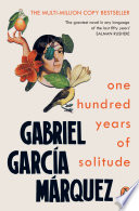
3. One Hundred Years of Solitude (1967) – First Spanish Edition by Vicente Rojo
 One Hundred Years of SolitudeAbout the book →
Gabriel García Márquez’s magical realism masterpiece demanded a cover that felt simultaneously grounded and otherworldly. Mexican artist Vicente Rojo achieved this with a striking composition featuring a galleon floating in the jungle, surrounded by rich, earthy tones and precise geometric frames. It set a high watermark for Latin American book design, marrying surrealist concepts with immaculate modernist layout.
The Power of Typography and Minimalism
In contemporary book design, minimalism has emerged as a dominant force. When stripping away complex illustrations, designers must rely heavily on typography, color theory, and negative space. The most beautiful book covers often whisper rather than shout, commanding attention through sheer elegance.
Consider the modern re-issues of classic literature, such as the Penguin Classics Deluxe Edition series or the Vintage International line. These editions often employ hand-lettered typography or unconventional grid structures that make a paperback feel like a collectible art object. When typography is treated as an organic illustration rather than a static font choice, the cover transforms into a kinetic experience.
- Negative Space: Utilizing empty space to create dual imagery or evoke a sense of isolation and focus.
- Custom Hand-Lettering: Designing bespoke letterforms tailored specifically to the mood and historical era of the book.
- Tactile Finishes: Employing debossing, foil stamping, matte lamination, and French fold jackets to engage the sense of touch.
"A book is a made object, not just a text. The cover is the threshold between the reader's world and the author's imagination. When designed with intention, it becomes a physical manifestation of magic." — Anonymous Book Designer
Modern Marvels: Contemporary Design Triumphs
Today, the publishing industry is experiencing a renaissance in cover design, driven by independent presses, boutique design studios, and an increased appreciation for physical books in a digital age. Art directors like Peter Mendelsund, Chip Kidd, and Paul Sahre have become household names among bibliophiles, pushing the boundaries of what a cover can communicate.
Take, for instance, Chip Kidd’s iconic cover for Haruki Murakami’s  Kafka on the Shore. By utilizing a split-toned, stark portrait juxtaposed with striking red typography and a barcode that doubles as part of the visual structure, Kidd created a cover that feels entirely enigmatic—mirroring Murakami’s narrative style. Similarly, Peter Mendelsund’s minimalist covers for the works of Franz Kafka use distorted geometry and fragmented type to visualize alienation and existential dread.
Furthermore, the rise of "special editions" from companies like The Folio Society or Subterranean Press has elevated book design into luxury craftsmanship. These volumes feature bespoke slipcases, gilded edges, original full-color illustrations, and sumptuous leather bindings that turn reading into a multisensory ritual.
How to Spot and Appreciate Great Book Design
As a reader, developing an eye for exceptional book covers deepens your appreciation for the publishing arts. Here is how you can train yourself to spot design brilliance:
- Look beyond the imagery: Ask yourself *why* the designer chose a specific color palette. Does the color evoke warmth, anxiety, nostalgia, or coldness?
- Examine the typography: Is the font a standard digital choice, or does it feel custom-made for the story? Notice how tracking (letter-spacing) and leading (line-spacing) create rhythm.
- Feel the materials: Run your fingers across the cover. Notice whether the matte finish provides a velvety resistance or if spot-UV gloss accents create a subtle, hidden layer of detail under the light.
- Analyze the relationship between title and image: Does the cover spoon-feed the plot to you, or does it offer a poetic, metaphorical interpretation that makes sense only after you finish reading?
Conclusion
The most beautiful book covers ever designed do much more than decorate our shelves; they preserve the cultural moments in which they were created and invite us into uncharted worlds. From the striking painted eyes of the Jazz Age to the sleek, typographic minimalism of the twenty-first century, extraordinary book design reminds us why physical books remain enduring treasures.
The next time you walk into a library or bookstore, pause for a moment. Let your fingers trace a textured spine, let your eyes wander across a brilliant layout, and remember that behind every great cover lies a world waiting to be unlocked.